 Back To My WorkGeoWealth1. GeoWealth2. Background Information3. Initial Research4. Design Concepts5.Testing & Iteration6. Reiteration7. Final Design8. Debrief
 Back To My WorkGeoWealth1. GeoWealth2. Background Information3. Initial Research4. Design Concepts5.Testing & Iteration6. Reiteration7. Final Design8. Debrief
The GeoWealth platform was created to allow End Clients a view into their financials in one central hub and allow them to check on their RIA's performance in the same platform.
At first glance, the platform inspires memories of AOL's homepage circa 20 years ago. The blocky elements and the overuse of tabs makes the platform feels outdated. For a company that touts its platform capabilities, the UI does not make a good first impression for the platform. Upon closer inspection, it seems that besides being an eyesore, the tabs also make it cumbersome to navigate. Findability is also poor, as all of the links to get to other places are hidden under dropdowns. Even the graphs require several clicks before the user can see the data labels.

Another issue we found was that there were very few visual cues that let the user know where they were in the information architecture. Going from one tier to the next was hard to tell, because all of the screens looked so similar. Can you tell how the images above and below are related? The image below is the main portfolio page, which contains all portfolios that belong to a specific household and allows users to navigate to specific portfolio pages, including the GeoWealth Stable Return Model portfolio page depicted in the above image.

Understand the daily routines, pain points, concerns, and goals for RIAs and End Clients.
Understand the role the GeoWealth platform plays with RIAs and End Clients.
Understand the relationship between RIAs and End Clients.
Identify any opportunities to streamline the experience.
We interviewed six GeoWealth employees and asked them to advocate the users. All users had heavy interactions with both RIAs and clients, two of them had been RIAs before coming to GeoWealth. What we found was the following:
End Clients and RIAs alike would frequently ask a GeoWealth representative for a report or specific KPIs without realizing that they already had the capability to get that information within the GeoWealth Platform.
RIAs and clients believed the UI to be dated, which made them believe that the technology behind the platform was also outdated.
End Clients barely interacted with the Client Portal, instead they called or messaged RIAs directly. Given some End Client’s propensity to overreact to negative news, RIAs were hesitant to increase engagement with the End Client out of fear that it would add more to their workload.
Using GeoWealth employees as proxy interviews was a core part of 'Assumptive Design'. It deviated from the ideal user centered design process that was taught in school but I felt like it had its own merits, especially in terms of speed.
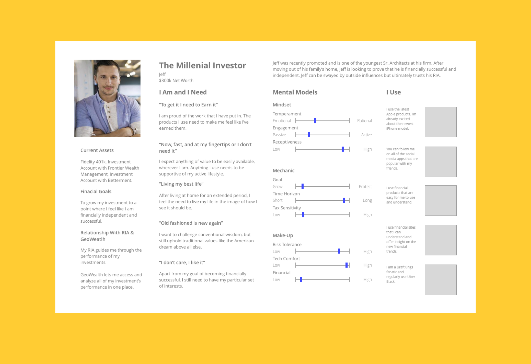
After affinity diagramming our insights, the team put together three protopersonas and identified three problem statements to solve for.
After identifying the need to provide motivation and feedback we created an assumptive problem statement to direct us in creating concepts:
The current experience was too complicated and discouraged users from exploring, keeping them from taking full advantage of the platform's features. How might we make the experience easy to use and at the same time robust enough to cater to their financial needs?
How might we update the UI to improve our users perception toward the GeoWealth platform?
How might we provide an experience that informs our end clients of their financial well being accurately and without creating unnecessary panic?
One of the most interesting aspects of assumptive design is that both the UX and UI is tested in front of users. This was done in order to emphasize speed in launching a design sooner than more traditional design methods. As one of three other product designers, our task was to iterate several concepts of one to two screens each in high fidelity, to get user feedback for both the UX and UI. The following are some early attempts at addressing the design problems we found in discovery.
For this concept, I wanted a design that would satisfy two of the three problem statements and do so in a no-frills way with the UI so that the more traditional, older, and less tech-saavy personas would not feel intimidated by the redesign. I hoped that the streamlined navigation system and decluttered screen would make it easier for users to navigate the experience and find the features that would make their lives easier.

This was another spinoff of the 'Safe' Concept. Unlike the earlier version, I felt like the other 'Safe' Concept made better use of all the space. I also envsioned the navigation to 'work' meaning that the navigation links would also double as notification signifiers. I added a chatbox so that users could contact their RIAs more easily, to remedy problem statement three – preventing user panic.

I created this concept based off of the competitive research the team conducted on financial apps like Acorns and Robin Hood. Both heavily used gradients in their backgrounds, which added flair and vibrancy to the flat UI style that you see on other apps. From a UX perspective, I believed that users would benefit from the ability to get to a household's investments easier. Similar to the other 'Safe' Concept, I wanted the navigation pane to do extra 'work', where I overlayed a mini graph of that investment's performance. I kept the tab structure but unlike the current GeoWealth platform, I cut down the amount of tabs to four, making the experience more streamlined.

I originally planned to bring three concepts to the table, using the latter three to test with users. The UX director, Chris, challenged me to come up with one more concept, one that would really push the boundaries. Unlike the other concepts that still incorporated some form of tabs, I designed this experience to do away with tabs completely. Similar to apps like Mint, each section was housed in a long scroll homepage. Users would navigate the long scroll and click on a section to get to the next level in the hierarchy. The dots on the right would act as a wayfinder and a means of navigating to other sections, similar to how one would go to a new section in a carousel. Clicking on a dot would manipulate the screen and 'take' the user to another section of the experience. The strength of this concept was that each screen was completely modular, making it easy to develop a design system. It also converted to mobile form much easier than the other concepts since it was absent of any side navigation.

After creating our initial concepts, the design team convened to share and critique our designs and then prioritize which of our designs to move forward with to reiterate. The team believed that 'Fluid' design was my most promising concept and it was decided that I would focus my efforts on this concept to eventually test with the users.
Some of the feedback I heard was that the right side "dots" needed to be moved to the left to align with how side navigation would conventionally be located. The "dots" were replaced with icons to be more communicative of each section it would represent. Some of the secondary CTA elements that were required of the system were left out in the original concept, thus were included under the 'actions' menu in the new variation. The three KPIs, total value, total contributions, and total growth were more important than I initially thought, thus were incorporated into the sticky menu so that they would be visible wherever the user was in the experience.

Scrolling down would bring up a new 'section tile' in view, similar to how paralax websites worked. This would ensure that each section would be represented in the most optimal way possible. Clicking the left hand menu would bring the user to the associated 'section tile'.

After each product designer had iterated on their concept, the team sought to solicit feedback from our users. We did this by publishing our designs on a whiteboard and held a workshop to solicit what users liked and didn't like about each concept.
Fluid Design:
Feedback:
- The longscroll, one-page, navigation was easy and intuitive for the younger users but more abstract for older users.
- GW liked the contemporary feel but afraid the extreme change would require big mental shifts on part of RIAs.
- GW favored this concept's microinteractions, such as the account cards, section tiles, graphs, and tables.
Blocks Design:

Feedback:
- GW liked the UI of blocks the best due to it being a 'middle-ground' of sorts – it had some aesthetics of the consumer-grade apps, but was still familiar-looking enough for the traditionalists to accept.
- Users felt the tabbed approach was familiar and easier to understand than the long scrolling approach.
- Some users were concerned with how this concept would translate to other screen sizes. This insight came to be prophetic, as the wide HD monitors and the smaller mobile screens would present several challenges to overcome.
After reviewing the positives and negatives of all concepts from our user's feedback, it became clear that the best route of satisfying both the UX and UI needs was to combine both fluid design and blocks design.

It was ugly. After the first couple of screens, I felt that the spirit of blocks had been lost due to the team trying to hard to incorporate both fluid and blocks equally. I believed that the influence of 'Blocks Design' needed to have a stronger presence as it was overwhelmingly favored by our user base. After bringing up these issues with the team, the team started working on creating 'Blocks V3'
Blocks 3 was a refinement of V2. The primary objective was to recapture the look and feel of the original Blocks UI while still combining some of the features that our users liked from other variations. I started by paginating out some of the sections in different tabs. This helped frame some of the more prominent elements of the UI, especially for the gradient background and the information cards.
The columniation of our user research, feedback from early concepts, the synthesizing between three different designers and the many cycles testing and iterating finally led up the final design of the advisor portal and the foundation of a design language system for GeoWealth's new platform.
The foundation of our design, the elements that make-up the look and feel of our platform are the three information cards and the intercepting gradient. The blocky, drab font that graced the old platform was replaced with a lighter, sleeker font to make the platform feel more modern and cutting-edge. The global navigation was streamlined and dropdowns were eliminated. Not only did this modernize the UI, it allowed users to see all options on screen, making navigation easier and more pleasant.

The dashboard is the first screen that users see and acts as the central hub that allows users to explore the other outlets of the platform. In order to make the dashboard more friendly to end users that may not have a high knowledge of finances

Being a financial application, most content was housed in a table of some form. There were 6 different tables to account for the content that was in the client portal. Cards were used to navigate users between accounts or portfolios. We used cards instead of the dropdown menus that was in the original version in order to create a more friendly and modern look. The cards also doubled as 'mini' graphs when rolled over, so that users could get a quick glimpse of an account or portfolios performance without having to go to the actual page.


The stakeholders were pleased with the results of our project. While some curious about how older users would react to the UI, GeoWealth was confident that the client portal was ready to be released and that further testing and iteration after release would further improve the project. As it was, the client portal provided a satisfactory foundation for the redesign of the rest of the platform.
In parallel with the client portal, the team also worked on the main GeoWealth Platform. We believed that launching both the client portal and the main GeoWealth platform at once would provide the most insight.
With assumptive design, the goal is to create a satisfactory experience, through design thinking methodology with a delivery that is faster than a traditional agile system. The feedback that would normally be solicited through user testing would be replaced by actual users and actual experiences after launch.
With feedback from users of the real platform, the next step was to iterate and solve user issues all through launch.